## What kind of change does this PR introduce?

bug fix a11y `ExapndableVideo`

## What is the current behavior?

`ExpandableVideo` blurred thumbnail has `alt="Video guide preview"`
sitting behind an overlay that already reads "Watch video guide" making
screen readers announcing the same thing twice

## What is the new behavior?

- adds an optional `videoTitle` prop that names the video once and feeds
both the button's `aria-label` and the player's `title`.

## Test
1. visit `/docs/guides/functions`

<!-- This is an auto-generated comment: release notes by coderabbit.ai
-->
## Summary by CodeRabbit

- **Enhancements**
  - Video previews in guides now display the relevant guide title.
  - Partner introduction videos now include a descriptive title.
- Video controls and embedded players provide more specific
accessibility labels when titles are available.
- Preview images without meaningful alternative text are treated as
decorative to reduce redundant screen-reader output.
- **Bug Fixes**
- Guide titles with Markdown formatting now appear as clean, readable
text in video labels.
<!-- end of auto-generated comment: release notes by coderabbit.ai -->
## I have read the
[CONTRIBUTING.md](https://github.com/supabase/supabase/blob/master/CONTRIBUTING.md)
file.
YES
## What kind of change does this PR introduce?
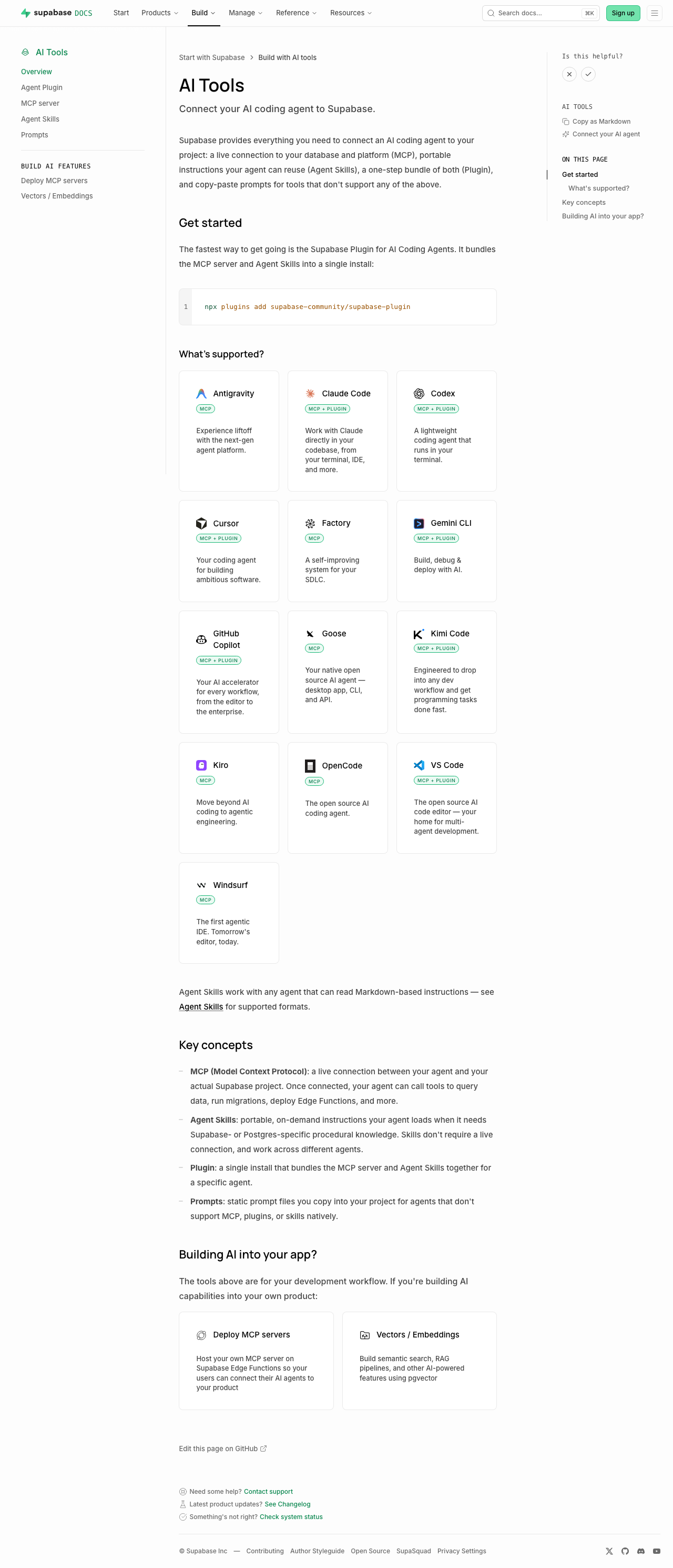
This PR reworks the `/guides/ai-tools` docs section to be agent-first.
The overview now leads with the fastest path to a working setup (the
plugin install command), a "What's supported?" card grid showing which
coding agents and IDEs work via Plugin and/or MCP (with each product's
own tagline, not a generated sentence), and a concepts glossary —
instead of a plain four-item list. The sidebar "AI Tools" widget, shown
on every guides page, now links to this hub ("Connect your AI agent")
instead of opening a ChatGPT/Claude chat frontend.
Closes DOCS-1201.
## What is the current behavior?
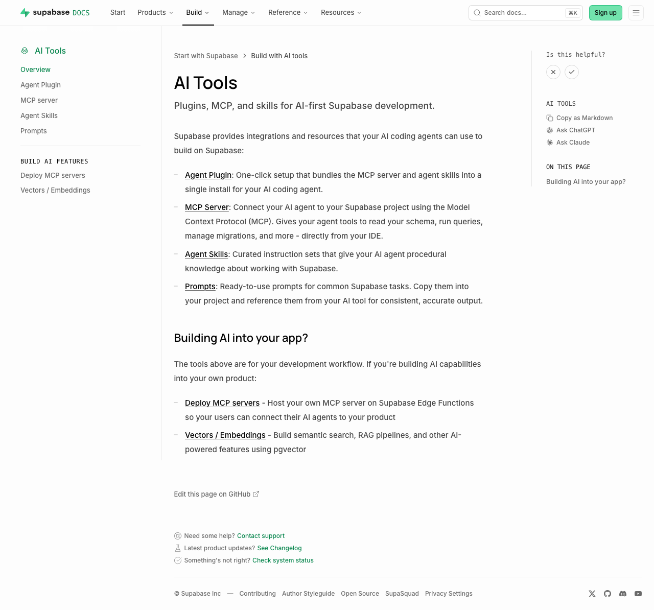
- The `/guides/ai-tools` overview is a plain four-item bullet list with
no getting-started path, compatibility info, or concepts explanation.
- The sidebar "AI Tools" widget offers "Copy as Markdown", "Ask
ChatGPT", and "Ask Claude" — the latter two send you to a chat frontend
instead of agent setup.
## What is the new behavior?
- `ai-tools.mdx`: intro → plugin install callout → "What's supported?"
card grid (`<ContentListings id="ai-tools-supported-agents" />`, icon +
tagline + Plugin/MCP badge per agent) → "Key concepts" glossary →
"Building AI into your app?" (also converted to `ContentListings`).
- New `data/content-listings/ai-tools.data.ts` builds the card grid from
the existing `PLUGIN_CLIENTS`/`MCP_CLIENT_DATA` client lists (no new
hand-maintained data) — fixing two latent bugs found along the way:
GitHub Copilot was keyed differently between the two sources (would have
produced duplicate cards), and Windsurf has no upstream docs URL (would
have been silently dropped).
- New opt-in `badgePosition` field on `ContentListingItem` so the badge
renders under the title for the agent grid, without changing the one
other existing badge usage (self-hosting's "Official" tag, still
inline).
- `plugins.mdx`/`mcp.mdx`/`ai-skills.mdx` each get a one-line "Quick
start" lead-in so they stand alone via the `.md` content-negotiation
route.
- `GuidesSidebar.tsx` + `telemetry-constants.ts`: Added "Connect your AI
agent" → `/guides/ai-tools`, and the `ask_ai_clicked` event with
`agent_setup_clicked`.
- Accessibility fix (from review): the "Not supported" indicator now
exposes an `sr-only` label instead of being fully `aria-hidden`.
## Additional context
- Worktree:
`~/GitHub/supabase/supabase-worktrees/nikrichers/docs-1201-make-guidesai-tools-agent-first-and-replace-chat-frontend`
- **Open question — Windsurf card**: `windsurf.com` now redirects to a
Devin Desktop page (Cognition acquired Windsurf in 2025), but Supabase's
own `MCP_CLIENT_DATA` still targets Windsurf's distinct config path
(`~/.codeium/windsurf/mcp_config.json`), so the card is still labeled
"Windsurf" with its pre-acquisition tagline ("The first agentic IDE.
Tomorrow's editor, today."). Needs a follow-up decision on whether to
relabel/merge/drop this card once Devin Desktop's MCP support (if any)
is confirmed.
- Follow-up (not in this PR): deeper IA rework of the ai-tools section
belongs to the broader agent-first audit;
`content/guides/resources/glossary.mdx` has no MCP/Agent
Skills/Plugin/Prompts entries yet — this PR's "Key concepts" is
currently the only definition of these terms site-wide.
- Verification:
| Check | Result |
| --- | --- |
| Lint (`lint:mdx`, `eslint`), `typecheck`, `test:local
lib/content-listings.test.ts` | Pass — 13/13 tests, 0 errors |
| `build:guides-markdown` | Pass — card grid flattens cleanly to
markdown |
| Playwright: broken icon requests, light + dark theme, PR preview |
Pass — 0 in either theme |
| `/guides/self-hosting` "Official" badge (existing `ContentListings`
usage) | Pass — unaffected by the new `badgePosition` opt-in |
### Before & After
#### [`/guides/ai-tools`](https://supabase.com/docs/guides/ai-tools)
Also shows the sidebar change (right rail): "Ask ChatGPT" / "Ask Claude"
→ "Connect your AI agent".
| [Before](https://supabase.com/docs/guides/ai-tools) |
[After](https://docs-git-nikrichers-docs-1201-make-guidesai-too-7c7493-supabase.vercel.app/docs/guides/ai-tools)
|
| --- | --- |
|
|
|
Sub-pages each just add a one-line "Quick start" callout under the intro
(no other layout change):
[plugins](https://supabase.com/docs/guides/ai-tools/plugins)
([preview](https://docs-git-nikrichers-docs-1201-make-guidesai-too-7c7493-supabase.vercel.app/docs/guides/ai-tools/plugins))
· [mcp](https://supabase.com/docs/guides/ai-tools/mcp)
([preview](https://docs-git-nikrichers-docs-1201-make-guidesai-too-7c7493-supabase.vercel.app/docs/guides/ai-tools/mcp))
· [ai-skills](https://supabase.com/docs/guides/ai-tools/ai-skills)
([preview](https://docs-git-nikrichers-docs-1201-make-guidesai-too-7c7493-supabase.vercel.app/docs/guides/ai-tools/ai-skills)).
### Test plan
- [x] `/guides/ai-tools` renders callout → card grid → concepts →
Building AI into your app, in order
- [x] Card grid: one card per agent (no duplicate Copilot), Windsurf
present, icons clean in both themes, taglines shown, badges below title
- [x] Sidebar shows "Connect your AI agent"; self-hosting's "Official"
badge unaffected
- [x] `.md` route still serves clean markdown; no lingering
`ask_ai_clicked`, ChatGPT/Claude icon, or `SupportedAgentsTable`
references
---------
Co-authored-by: Nik Richers <nik@validmind.ai>
## What kind of change does this PR introduce?

Accessibility / lint hardening (Safari keyboard focus).

## What is the current behavior?

`supabase/require-explicit-tabindex` is `'warn'`. Studio’s ratchet was
at 0 but the rule was still ratcheted; www / docs / design-system still
had raw `<button>` / `role="button"` call sites without an explicit
`tabIndex`.

[DEPR-627](https://linear.app/supabase/issue/DEPR-627) · follow-up to
#47984 / #48040

## What is the new behavior?

- Shared config: `'supabase/require-explicit-tabindex': 'error'`
- Swept www / docs / design-system (+ Studio test fixtures the ratchet
skipped)
- Removed the rule from the Studio ratchet + baselines

## To test

Prefer **Safari**. This PR only adds explicit `tabIndex` to raw
`<button>` / `role="button"` call sites — not links, and not controls
that already go through `Button` from `ui`.

### Marketing (`www`) ([staging
link](https://zone-www-dot-com-git-danny-depr-627-promote-req-7ae43c-supabase.vercel.app/))

- [x] Homepage frameworks / dashboard feature tabs — Tab through each
tab button
- [x] Product pages (e.g. `/auth`, `/database`) — section tab switchers
- [x] Narrow viewport — open the hamburger; Tab through menu buttons
- [x] `/partners/catalog` — filter / view controls
- [x] Blog view toggle (list ↔ grid)

### Docs ([staging
link](https://docs-git-danny-depr-627-promote-require-explici-25e46d-supabase.vercel.app/))

- [x] **Desktop (≥ lg):** top-right **⋯ menu** (hamburger icon) — opens
a dropdown that includes Theme. Not a separate theme button.
- [x] **Mobile (< lg):** top-right **hamburger** opens the sheet; close
(X) is the raw button we tagged. Theme inside the sheet uses
`ThemeToggle` / `DropdownMenuTrigger` from `ui` (already supposed to set
`tabIndex`).
- [x] **Code blocks** — copy / language controls
- [x] **Is this helpful?** — X / check are `Button` from `ui` (should
already Tab). After voting **while signed in**, the follow-up “What went
well?” / “How can we improve?” text button is the raw one we tagged.
- [x] **AI Tools → Copy as Markdown** (right rail on a guide) — this is
the only GuidesSidebar control this PR changed. “On this page” TOC items
are **links**, not covered by this lint.
- [x] **Reference docs** (e.g. JS client reference) — section headers
that expand/collapse in the left nav (`Collapsible.Trigger`)
- [x] **Troubleshooting index** — type in the search field, then Tab to
the **clear (X)** control

### Dashboard (`studio`)

No production UI changes in this PR (tests + lint config only). Quick
Safari smoke that prior tabindex work still holds:

- [x] Project sidebar — Tab through primary nav links
- [x] Settings → General — Tab through inputs / buttons
- [x] Storage → Files — Tab a bucket row / file actions
## What kind of change does this PR introduce?

Bug fix: custom icons now respect their source SVG’s stroke/fill and
stroke-width instead of always getting a global stroke.

## What is the current behavior?

Every custom icon gets `stroke="currentColor"` and `strokeWidth={2}`
from `createSupabaseIcon`, so fill-only logos get an extra stroke and
icons designed at `stroke-width="1"` (e.g. postgres, auth) render too
thick. Call sites and the design-system grid needed workarounds
(`strokeWidth={0}`, `FILL_ONLY_ICONS`, `STROKE_WIDTH_FROM_SOURCE`).

## What is the new behavior?

The icon build reads root SVG attributes (`fill`, `stroke`,
`stroke-width`, etc.) and passes them as per-icon defaults. Fill-only
icons (chatgpt, claude, axiom, last9) have `stroke="none"` in source and
render with no stroke; stroke icons keep their source stroke-width (e.g.
postgres at 1). No `strokeWidth={0}` or allowlists needed at call sites
or in the icon grid.

| Before | After |
| --- | --- |
| <img width="1826" height="552" alt="CleanShot 2026-03-05 at 10 53
31@2x-3D63CEF0-1132-44F5-A382-730346432F1E"
src="https://github.com/user-attachments/assets/9caf73fa-351b-4ea2-a420-b3339f934742"
/> | <img width="1814" height="552" alt="CleanShot 2026-03-05 at 10 53
40@2x-514FC8BD-D30F-4D23-B209-0ECD6D13A184"
src="https://github.com/user-attachments/assets/936ea5a5-dae0-413f-8545-b90a502cea69"
/> |

## Additional context

- Added `stroke="none"` to the four fill-only source SVGs;
sentry/grafana/otlp/datadog already had `stroke-width="0"`.
- `createSupabaseIcon` only applies `color`/`strokeWidth` when the
consumer passes them, so `svgDefaults` from the build are used
otherwise.
- Removed workarounds from `icons.tsx` and GuidesSidebar; updated
icons.mdx (defaults + fill-only guidance).
 Anthony Lio

